Faceplates
Faceplates let you build custom control panels for your plugins and racks. Instead of using the default parameter list, you can design a visual layout with knobs, sliders, buttons, meters, and labels -- arranged exactly the way you want.
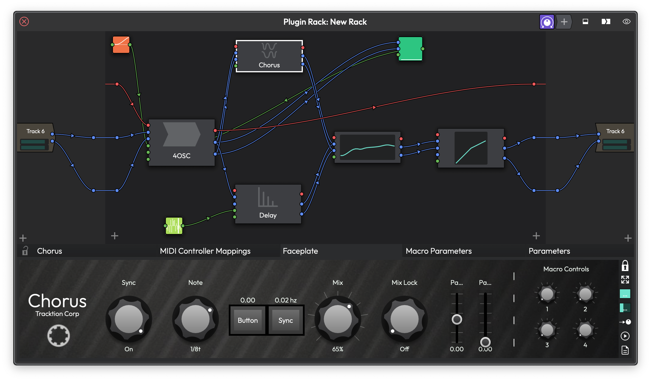 A Chorus plugin with a custom faceplate showing rotary knobs, buttons, parameter names, value readouts, and level meters.
What Is a Faceplate?
A faceplate is a custom graphical interface you create for any plugin or rack. It sits on top of the default plugin view and gives you direct, visual access to the parameters you care about most. You can design one from scratch or load a factory preset that ships with Waveform.
Faceplates are especially useful when you want to focus on a handful of key parameters without wading through a plugin's full control set. They're also great for racks, where you might want a unified panel that exposes controls from several plugins at once.
Getting Started
When you first open a plugin's faceplate tab, you'll see the message "No Faceplate -- click the padlock icon to begin editing." The edit toolbar runs along the right edge of the faceplate area.
To create your first faceplate:
- Click the Padlock button on the right toolbar to unlock edit mode.
- Click on any empty grid cell. A menu appears listing the available control types.
- Choose a control type (for example, Slider or Parameter).
- The new control appears on the grid. Right-click it or left-click it to assign a plugin parameter.
That's all it takes. Lock the padlock again when you're done, and your faceplate is ready to use.
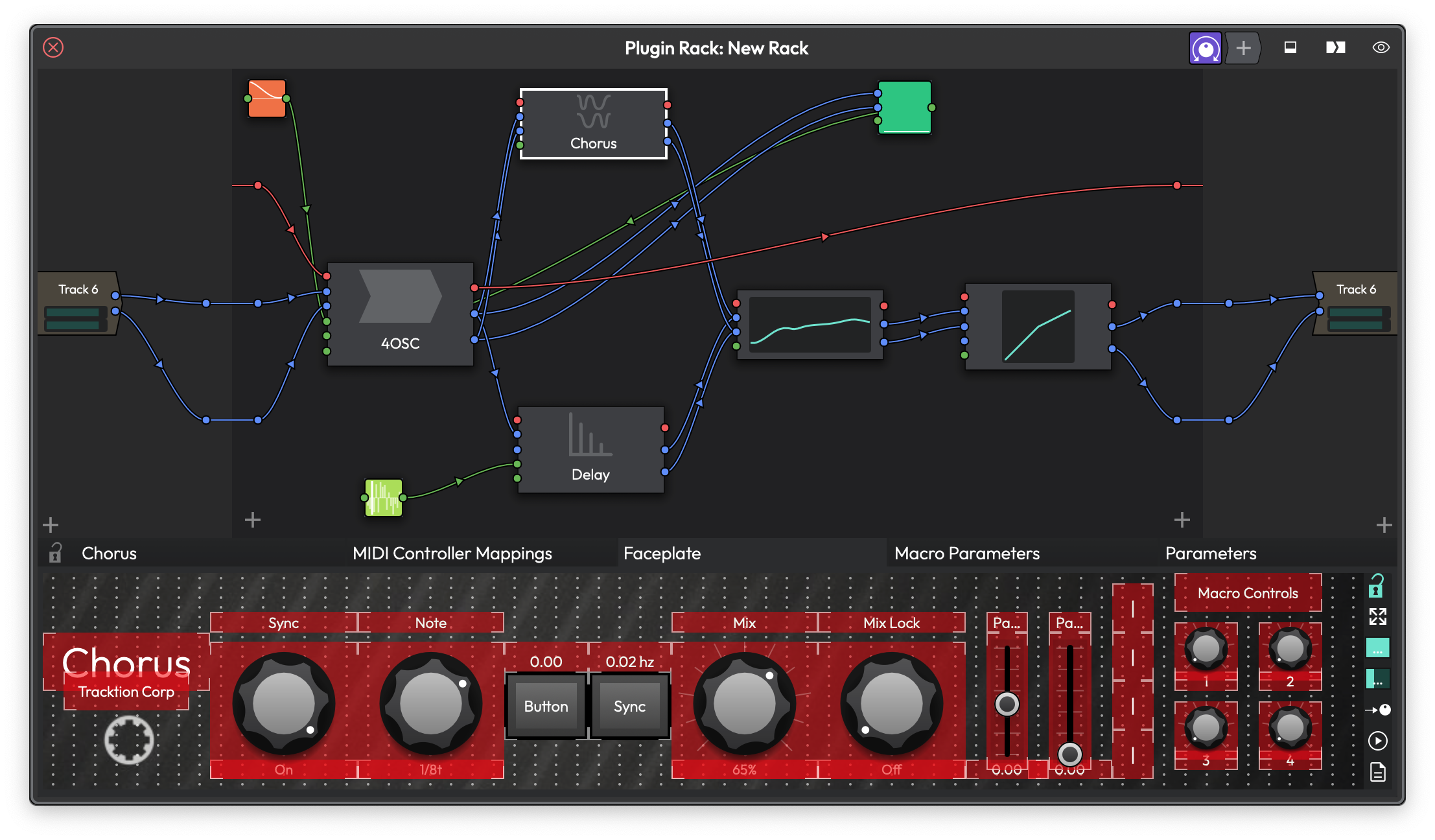 Edit mode active: controls are highlighted in red with visible borders, and the grid dots are shown for placement guidance.
The Edit Toolbar
The toolbar on the right side of the faceplate contains these buttons, from top to bottom:
Padlock -- Toggles edit mode on and off. When locked, you interact with the controls normally. When unlocked, you can move, resize, add, and remove controls. The grid dots become visible in edit mode.
Stretch -- When enabled, the faceplate stretches to fill all available space. When disabled, the faceplate maintains its fixed grid proportions.
Assign -- Enters parameter assign mode. When active, this button pulses to indicate it's waiting for you to move a parameter. Tweak any parameter on your plugin, and it gets assigned to the currently selected control. This is the fastest way to connect controls.
Quick Assign -- When enabled alongside assign mode, the faceplate automatically advances to the next control after each successful assignment. This lets you rapidly assign a whole panel by just tweaking parameters one after another.
Presets -- Opens a menu for saving, loading, and managing faceplate presets. More on this below.
Width Slider -- Sets the number of horizontal grid columns. (Default: 8)
Height Slider -- Sets the number of vertical grid rows. (Default: 4)
💡 Tip: You can hide the edit toolbar by right-clicking the faceplate background and unchecking Show edit menu. Right-click again to bring it back.
The Grid System
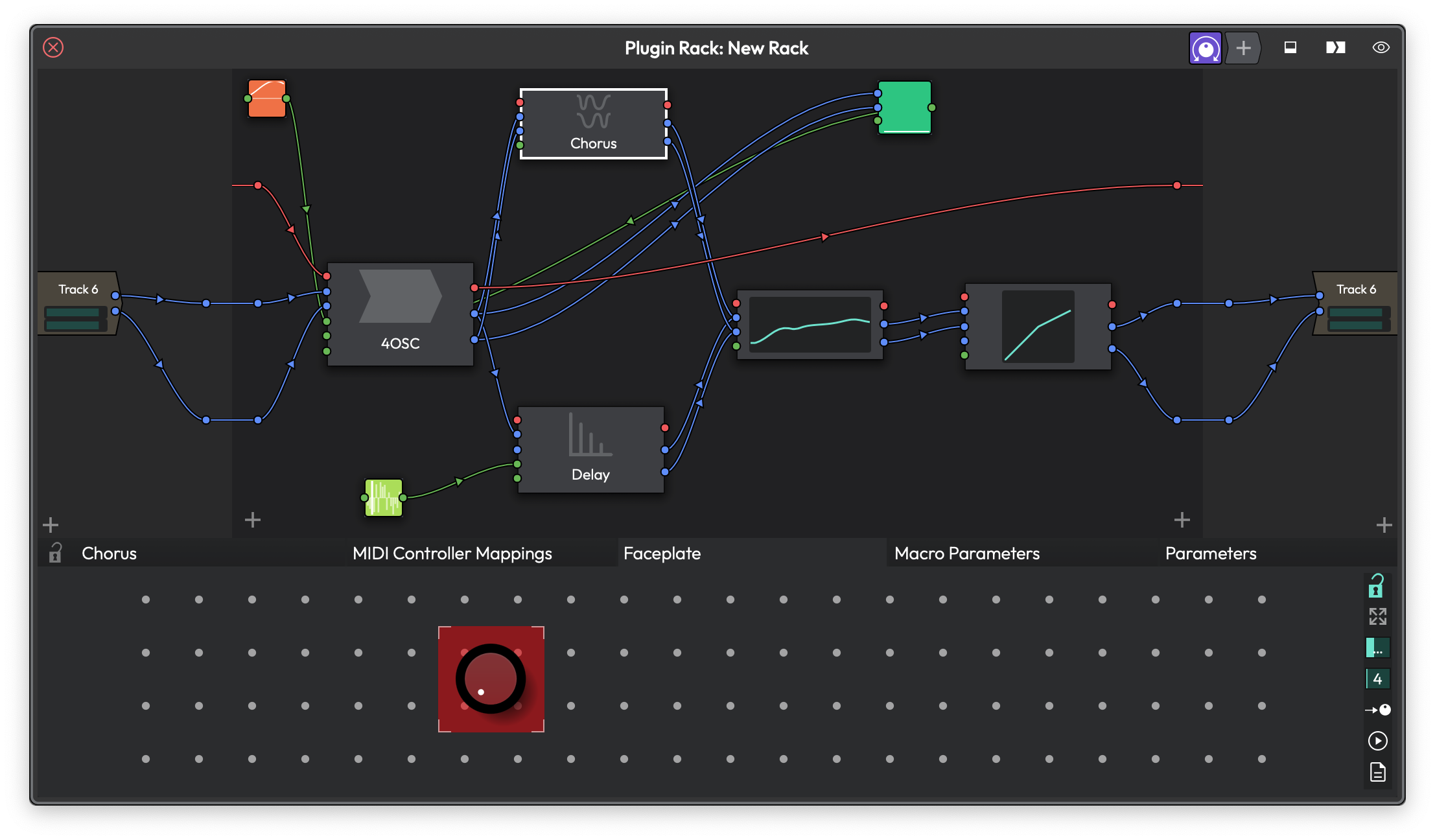
A faceplate in a plugin rack, with the faceplate grid shown below the rack.
Faceplates use a grid layout. Every control snaps to grid cells and can span multiple cells. The grid maximum size is 64 by 64, which gives you plenty of room for complex layouts.
To resize the grid, use the width and height sliders in the edit toolbar. If you need finer control over placement, right-click the faceplate background and select Double grid resolution. This doubles both the width and height of the grid and scales all existing controls to match, giving you twice the positioning precision without changing how anything looks.
📝 Note: If you shrink the grid smaller than your current controls, Waveform automatically enlarges it to fit. You'll see a message letting you know.
Control Types
Faceplates offer eight types of controls. Each one serves a different purpose.
Slider
A knob or fader that controls a single parameter. This is the most common control type.
Style -- Right-click a slider and choose from the Style submenu: - Rotary -- A traditional knob. (Default) - Linear horizontal -- A horizontal fader. - Linear vertical -- A vertical fader. - Linear bar -- A horizontal bar that fills as the value increases. - Linear bar vertical -- A vertical bar that fills upward.
Snap to mouse position -- Found under the Options submenu. When enabled, clicking the slider jumps the value to wherever you click. When disabled, the slider uses relative dragging, which is gentler for fine adjustments. (Default: snap enabled)
Sliders also support custom filmstrip images, rotary images (background + rotating thumb), and linear images (background + sliding thumb). See the Skins section below.
Parameter
A combined control that shows a parameter name label at the top, a rotary knob in the middle, and the current value readout at the bottom. It's a slider, name, and value display all in one.
Style -- Same slider style options as above.
Large text -- Toggle this from the right-click menu to increase the size of the name and value labels to fill their area.
Parameter Name
A text label that automatically displays the name of the assigned parameter. If you rename a macro parameter, this label updates to match.
Large text -- Scales the text up to fill the available space.
Parameter Text
A text readout that shows the current value of the assigned parameter as a formatted string (for example, "2.5 kHz" or "-12.0 dB"). It updates in real time as the parameter changes.
Large text -- Scales the text up to fill the available space.
Label
A static text label for annotation. Labels don't connect to any parameter -- they're purely for display. Use them to label sections of your faceplate or add descriptions.
Right-click a label and choose Set text to edit what it says.
Large text -- Scales the text up to fill the available space.
Button
A toggle button that switches a parameter between its minimum and maximum values. It's useful for on/off parameters like bypass switches or enabling features.
Right-click and choose Set button text to customise the label. If you don't set custom text and a parameter is assigned, the button shows the parameter's name automatically. Buttons can also use filmstrip images for their on/off states.
XY
A two-dimensional pad that controls two parameters simultaneously -- one for the X axis and one for the Y axis. Drag anywhere on the pad to adjust both values at once. This is great for effects like filter cutoff vs. resonance or delay time vs. feedback.
Reset after moving -- When enabled, the pad snaps back to the default values when you release the mouse. Useful for performance effects where you want temporary parameter changes.
The XY pad supports custom background and thumb images from the Skin menu.
Meter
A level meter that displays the output of a Level Meter plugin. Unlike other controls, meters don't map to automatable parameters. Instead, you assign them to a Level Meter plugin instance.
Style -- Choose from the right-click menu: - Stereo -- Shows both left and right channels side by side. (Default) - Left -- Shows only the left channel. - Right -- Shows only the right channel. - Peak -- Shows whichever channel is louder.
Stretch to fit -- When enabled, the meter stretches to fill its grid cells. When disabled, it maintains the aspect ratio of its image.
📝 Note: You must have a Level Meter plugin on the track or in the rack for the meter control to display any levels. Assign the meter to the plugin via its right-click menu.
Working with Controls
Adding Controls
In edit mode, there are two ways to add controls:
- Click an empty cell -- A menu appears listing all control types. Choose one, and it's placed at that position spanning a 2x2 area by default.
- Drag across empty cells -- Click and drag to define a rectangular area on the grid, then choose the control type from the menu. The control is created to fill the area you selected.
Moving and Resizing
In edit mode, controls show a hand cursor when you hover over their centre. Drag to reposition them on the grid.
To resize, hover near the edge of a control. The cursor changes to indicate which edge you can drag: - Top or bottom edges show an up-down resize cursor. - Left or right edges show a left-right resize cursor.
Drag the edge to grow or shrink the control.
Copying Controls
Hold any modifier key (Cmd on Mac, Ctrl on Windows) while dragging a control to create a duplicate. The copy is placed wherever you drop it.
Removing Controls
Right-click any control and choose Remove control.
To clear everything at once, right-click the faceplate background and choose Remove all controls.
Reordering
Right-click a control and choose Send to back to push it behind overlapping controls. Clicking a control during edit mode brings it to the front automatically.
Assigning Parameters
Every control (except Label and Meter) needs to be connected to a plugin parameter before it does anything useful. There are several ways to make assignments.
Left-Click Assignment
In edit mode, left-click a control. A menu appears listing all available parameters from the plugin, grouped by macros and plugin parameters. Choose one.
Right-Click Assignment
Right-click a control and look for the Assign parameter submenu. It offers: - None -- Removes any current assignment. - Macros -- Lists macro parameters. - Modifiers -- Lists modifier parameters (for racks). - All plugin parameters grouped by plugin.
Assign Mode (Tweak-to-Map)
This is the fastest method:
- Click the Assign button in the edit toolbar (or enable it from the right-click menu).
- Click the control you want to assign. It highlights with a glowing border.
- Move any parameter on the plugin (turn a knob in its native UI, for example). The parameter is instantly assigned to the highlighted control.
- Click the next control to assign, or enable Quick Assign to have Waveform automatically advance through controls left-to-right, top-to-bottom.
A bubble message confirms each assignment by name.
Auto-Assign All Controls
Right-click the faceplate background and choose Assign all controls. A dialog appears where you can choose: - Whether to assign Plugin Parameters or Macros. - Which parameter to start from.
Waveform then assigns parameters sequentially to controls in left-to-right, top-to-bottom order.
Removing Assignments
Right-click the background and choose Remove all assignments to clear every control's parameter mapping at once.
Background Customisation
Right-click the faceplate background (not on a control) and look under the Background submenu.
Set colour -- Opens a colour picker to set a solid background colour behind all your controls.
Set image -- Browse for a background image (JPG, PNG, GIF, or SVG). The image is embedded in the faceplate, so it travels with your presets.
Image alpha -- A slider to adjust the transparency of the background image. (Default: 1.0, fully opaque)
Image placement -- Controls how the image fills the faceplate area: - Centre -- Displays the image at its original size, centred. - Stretch -- Stretches the image to fill the entire faceplate, ignoring aspect ratio. - Fill -- Scales the image to fill the faceplate while maintaining aspect ratio (may crop edges). - Tile -- Repeats the image as a tile pattern. Only available for bitmap images, not SVGs.
Clear background -- Removes the colour and image.
Skins
Skins change the visual appearance of knobs, sliders, and other controls. You can apply a skin to the entire faceplate or to individual controls.
Global Skin
Right-click the faceplate background and open the Default skin submenu. Available skins:
- Default -- The standard Waveform appearance.
- Juicy -- A modern, clean look.
- Nord -- Inspired by red Nord-style synthesiser controls.
- Moog -- Large, chunky knobs reminiscent of Moog synthesisers.
- Juno -- A classic analog synthesiser style.
- Mono Classic -- Understated, bass-synth-inspired controls.
- Mono Modern -- A contemporary take on the classic mono style.
- Mono Wired -- An industrial variant with hard edges.
- Digital -- A clean, digital-looking style.
Per-Control Skin
Right-click any individual control and open the Skin submenu. Choose a skin to override the faceplate-wide default for just that control.
Custom Images (Filmstrips)
For sliders, parameters, buttons, and meters, you can load custom graphics from the Skin menu:
Filmstrip Image -- A single image file containing all frames of the control stacked vertically or horizontally. Waveform estimates the number of frames from the image dimensions, but you can set it manually via Set number of frames. Supports JPG, PNG, GIF, and SVG.
Rotary Image (sliders only) -- Instead of a filmstrip, you provide two separate images: - A Background image that stays fixed. - A Thumb image that rotates around the centre. You set the rotation range in degrees.
Linear Image (sliders only) -- Two separate images for fader-style controls: - A Background image (the track). - A Thumb image (the handle) that slides along the background.
Once you've loaded images into a faceplate, they become available in the Load existing submenu for reuse across other controls.
💡 Tip: SVG images scale cleanly at any size and are generally recommended over bitmap formats for custom skins.
Faceplate Size
By default, faceplates use Fit to space mode, where the faceplate stretches to fill whatever area is available. You can turn this off and set a fixed pixel size instead.
Right-click the background, open the Background submenu, then Set size:
Fit to space -- When checked, the faceplate automatically scales. (Default: on)
Width -- Fixed width in pixels (50 to 2000). Only available when Fit to space is off.
Height -- Fixed height in pixels (50 to 2000). Only available when Fit to space is off.
The Stretch button on the toolbar is separate from this -- it controls whether grid cells stretch proportionally or maintain equal square proportions.
Presets
Faceplates can be saved and loaded as .tracktionfaceplate files. Waveform includes factory presets for its built-in plugins.
Factory Presets
The following built-in plugins come with pre-made faceplates: Auto Filter, Bus Compressor, Chorus, Compressor, Crusher, Ducker, EQ, Flanger, Gate/Expander, Limiter, Phaser, Reverb, Stereo Delay, and Tape Delay.
When you open a plugin that has a matching factory preset, Waveform can automatically load it.
Loading a Preset
Click the Presets button (file icon) in the edit toolbar. You'll see:
- Load plugin preset -- Shows only presets that were saved for this specific plugin type. Loads silently without prompting.
- Load generic preset -- Shows all available presets. Opens a dialog where you can choose which elements to import.
- Load preset from file -- Browse your file system for a
.tracktionfaceplatefile.
When loading a generic preset, you can selectively import: - Size -- The grid dimensions. - Controls -- All the knobs, sliders, labels, and so on. - Background -- Colours and images. - Parameter mappings -- Which parameters are wired to which controls (if the plugin has matching parameters). - Show assign parameters options when done -- Pops up the auto-assign dialog after loading, so you can quickly remap controls.
Saving a Preset
Click the Presets button and choose Save preset to file. Browse to a location and give your faceplate a name. The plugin type is saved along with the faceplate, so it can be auto-matched later.
Presets are stored in your Waveform preferences folder under a Faceplates directory. Choose Open the presets folder from the presets menu to go there directly.
Deleting a Faceplate
To remove a faceplate from a plugin entirely, click the Presets button and choose Delete faceplate. This removes all controls, background settings, and parameter assignments.
⚠️ Warning: Deleting a faceplate cannot be undone with Cmd + Z / Ctrl + Z if the plugin window closes. Save it as a preset first if you might want it back.
Faceplates on Racks
Faceplates work on racks as well as individual plugins. When building a faceplate for a rack, the parameter assignment menus list controls from all plugins within the rack, grouped by plugin name. You can also assign macro parameters and modifier parameters that belong to the rack.
This makes faceplates especially powerful for racks: you can build a single unified control surface that exposes the most important parameters from multiple plugins, all in one place.
⚡ Things to Watch Out For
-
Edit mode blocks control interaction. While the padlock is unlocked, you can't turn knobs or click buttons -- all mouse actions relate to layout editing. Lock the padlock to return to normal use.
-
Grid resolution is permanent. Doubling the grid resolution can't be undone by halving it, since the controls have already been scaled. Plan your grid size before placing many controls.
-
Meter controls need a Level Meter plugin. If your meter shows nothing, make sure you've added a Level Meter plugin to the track or rack and assigned it in the meter's right-click menu.
-
Filmstrip frame count matters. If a custom slider image looks wrong, right-click it and check Set number of frames under the skin menu. The auto-detection works well for square frames but can miscount with non-standard aspect ratios.
-
Presets store images. Background images and filmstrip graphics are embedded in both the plugin state and preset files. Using very large images will increase your project file size.
-
Quick assign order is spatial. Auto-assign and quick-assign both process controls left to right, top to bottom. If your layout doesn't follow that reading order, the assignments may not land where you expect. Rearrange controls on the grid or use manual assignment instead.
Moving On
Faceplates give you a streamlined way to interact with your plugins without getting lost in parameter lists. Start simple with a few Parameter controls and the auto-assign feature, then refine your layouts with custom images and skins as you get comfortable. Once you've built a faceplate you like, save it as a preset so you can reuse it across projects.